Case Study:
Trips to Discover
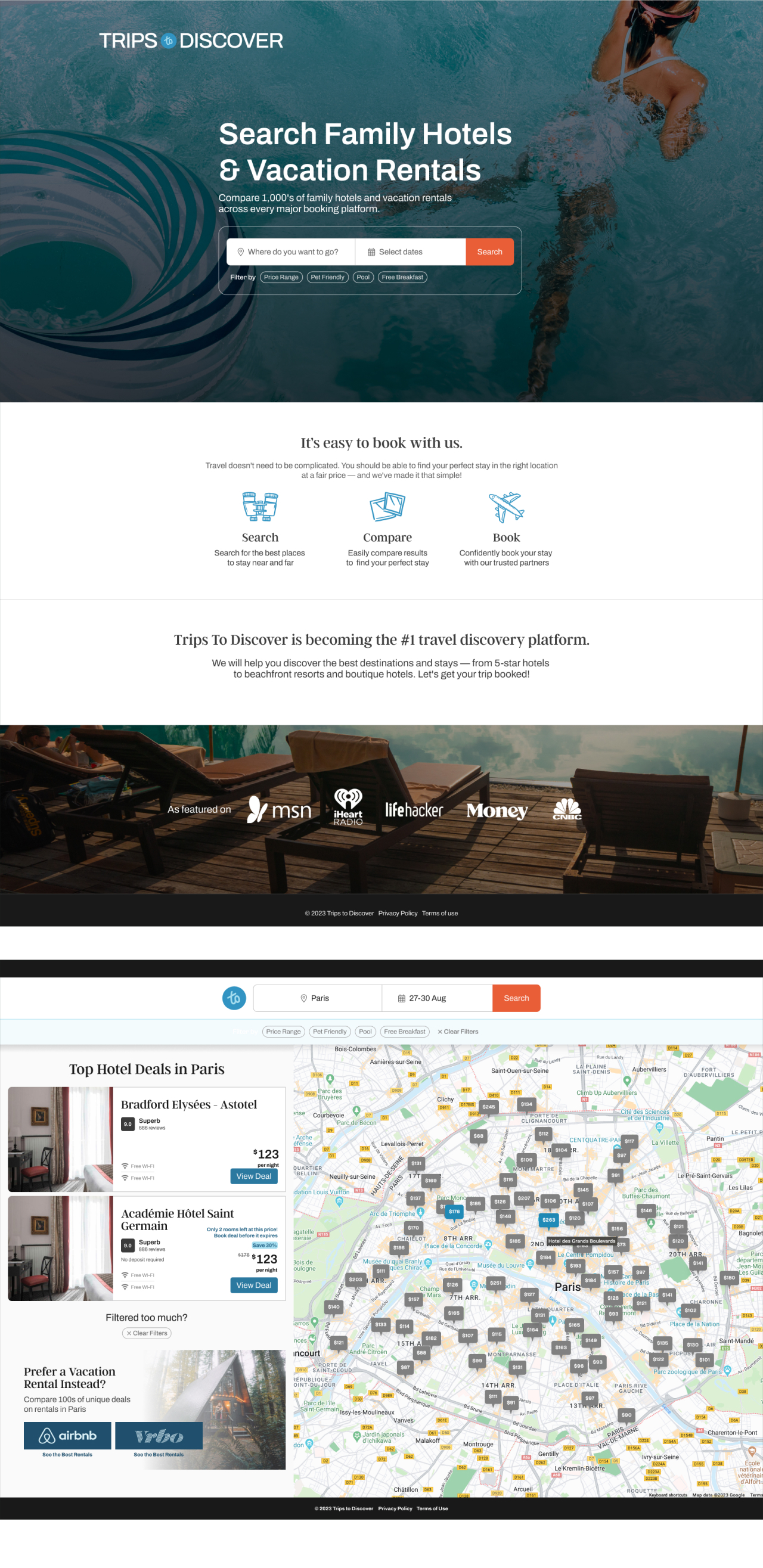
A travel inspiration platform, and hotel booking system, helping travellers turn their travel daydreams into reality.
A travel inspiration platform, and hotel booking system, helping travellers turn their travel daydreams into reality.
The CEO of Trips to Discover reached out to me to help them with improving the overall UI and user experience of their platform.
I worked with their marketing and development team over a six month period to review their brand and web assets, establish a design system and implement a UI refresh project with the dev team.
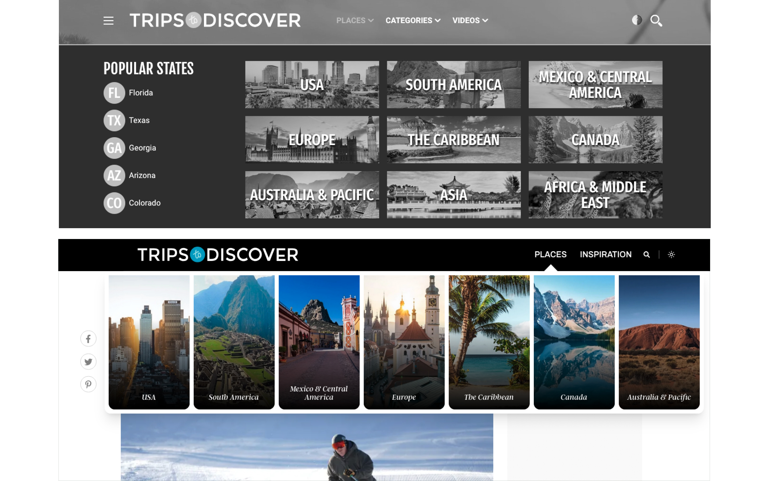
After reviewing their codebase and discussing it with the CTO, I discovered that their system had only very basic theme elements implemented.
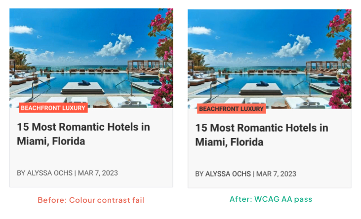
There were no consistent spacing rules, typography styles, or text hierarchy in place. Additionally, the limited colour swatches used were arbitrary and did not meet WCAG standards.
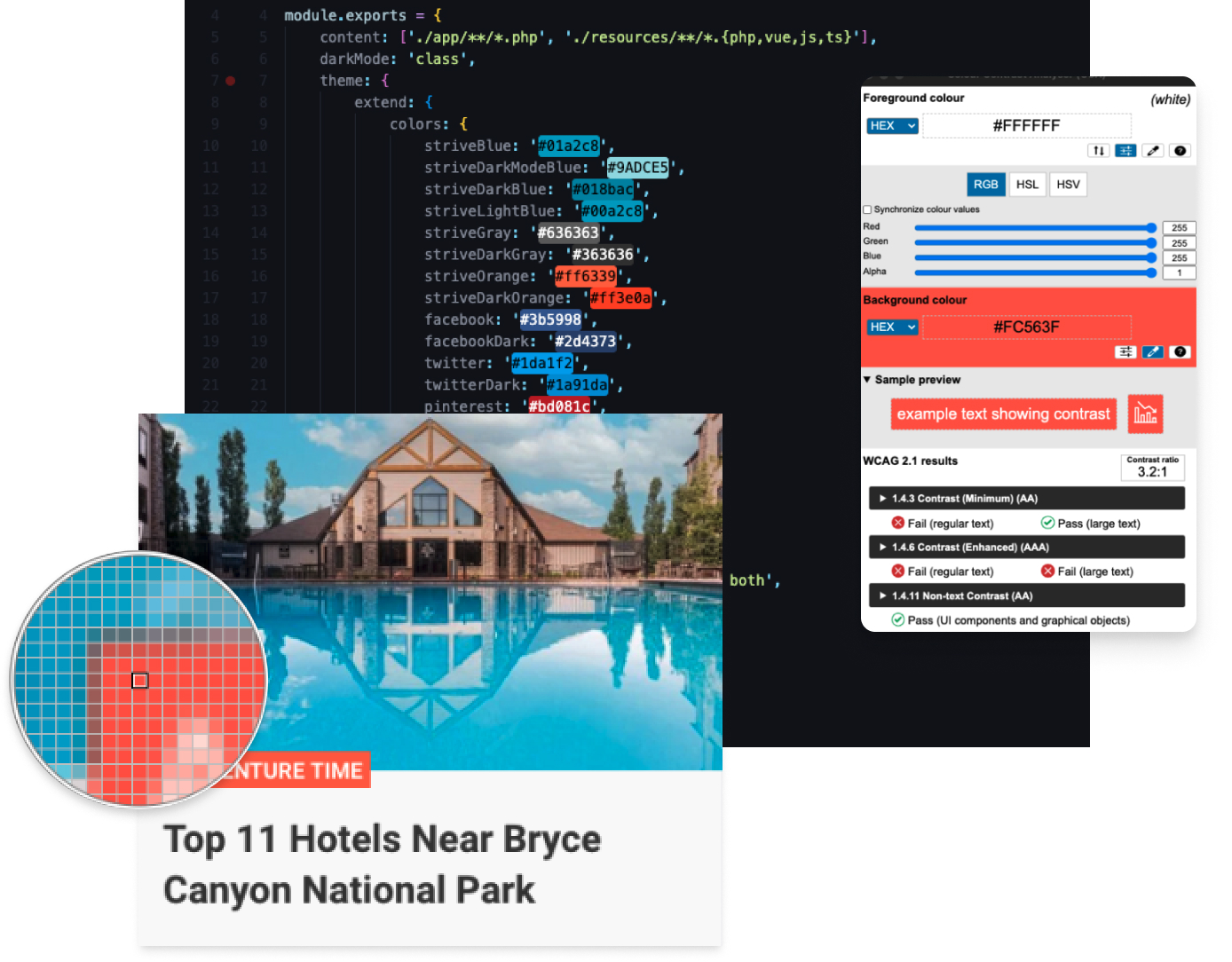
I set out to deliver some quick wins by addressing some foundational design principles, starting with the accessibility of colours and text. I developed and refined the design system in Figma and within the Tailwind config file in the codebase.
Previous research into colour accessibility had introduced me to the CIELAB colour model, which focuses on lightness and WCAG contrast of colours. I’ve found this model essential for maintaining WCAG standards in large systems that include multiple themes, dark modes, and considerations for colour blindness. As the codebase was already using the TailwindCSS framework I was able to seamlessly integrate the new colour swatch sets into the codebase.
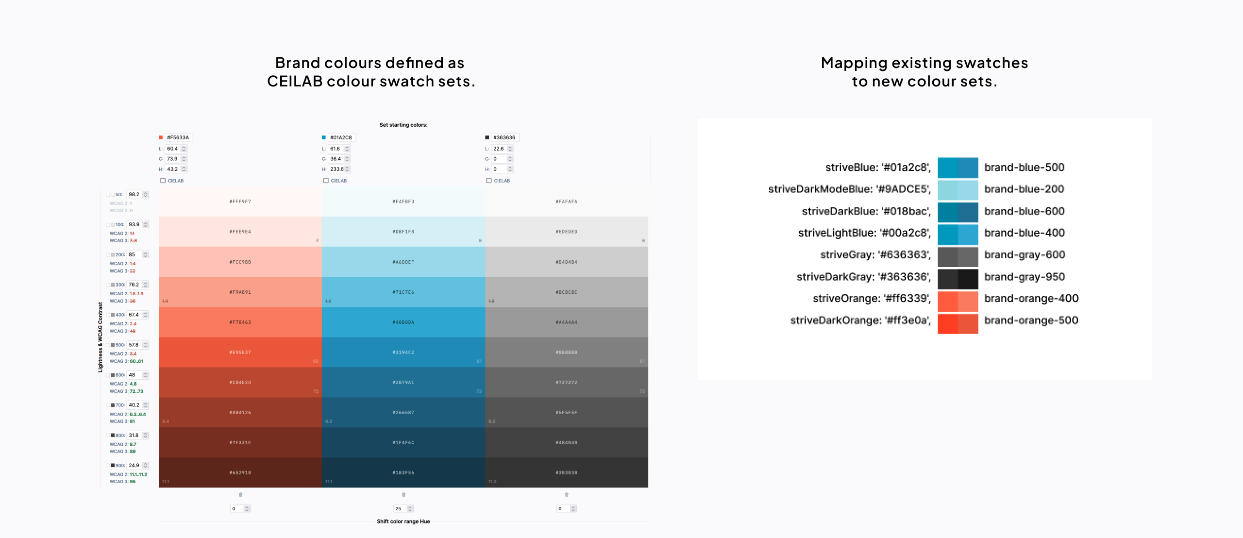
I was given access to the codebase so I could implement the new colour sets across all components in the codebase and simultaneously tested the colour contrast for every text element to ensure all text met at least AA standards.
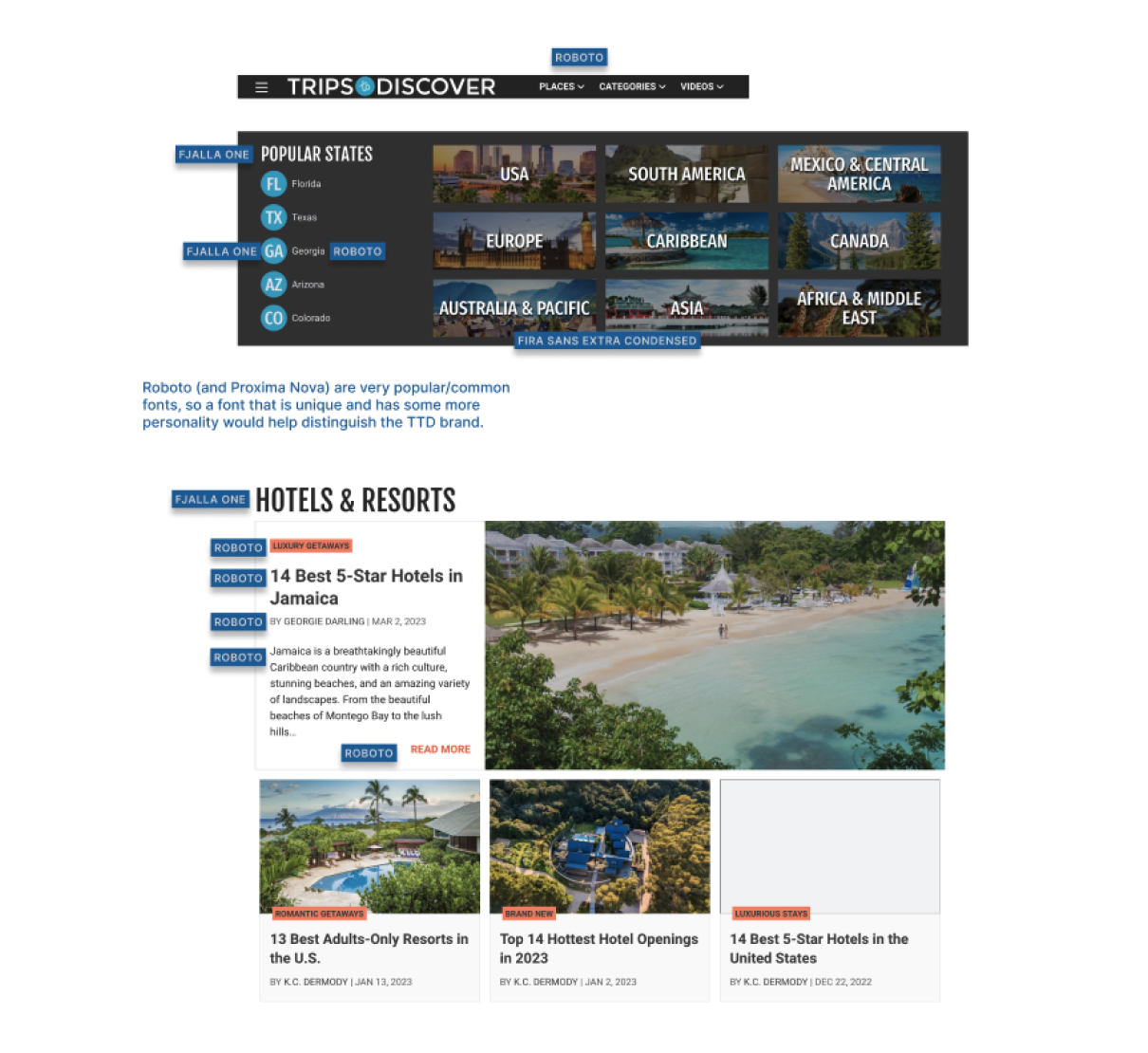
It quickly became apparent to me that I would need to open up discussions with the CEO and marketing team about their brand— after auditing all the fonts used on the platform, including the logo, I identified some issues with the quantity, quality and usage of the fonts.
I initiated some discussions with the CEO, but to keep the project moving, I focused on addressing the readability and typographical hierarchy of all the text.
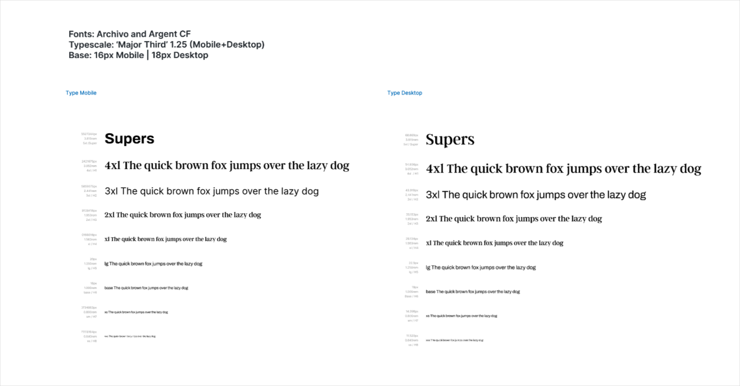
I created a typescale in the design system to promote a consistent heirachy of information across the platform.
In my initial audit, I found that the development team was using arbitrary font sizes to fix layout issues. I resolved this by defining a base font size adjusted according to viewport size, and built the type scale off this.
I continued to make incremental enhancements to the codebase to implement the foundational design system elements— accessible text, colours and spacing.
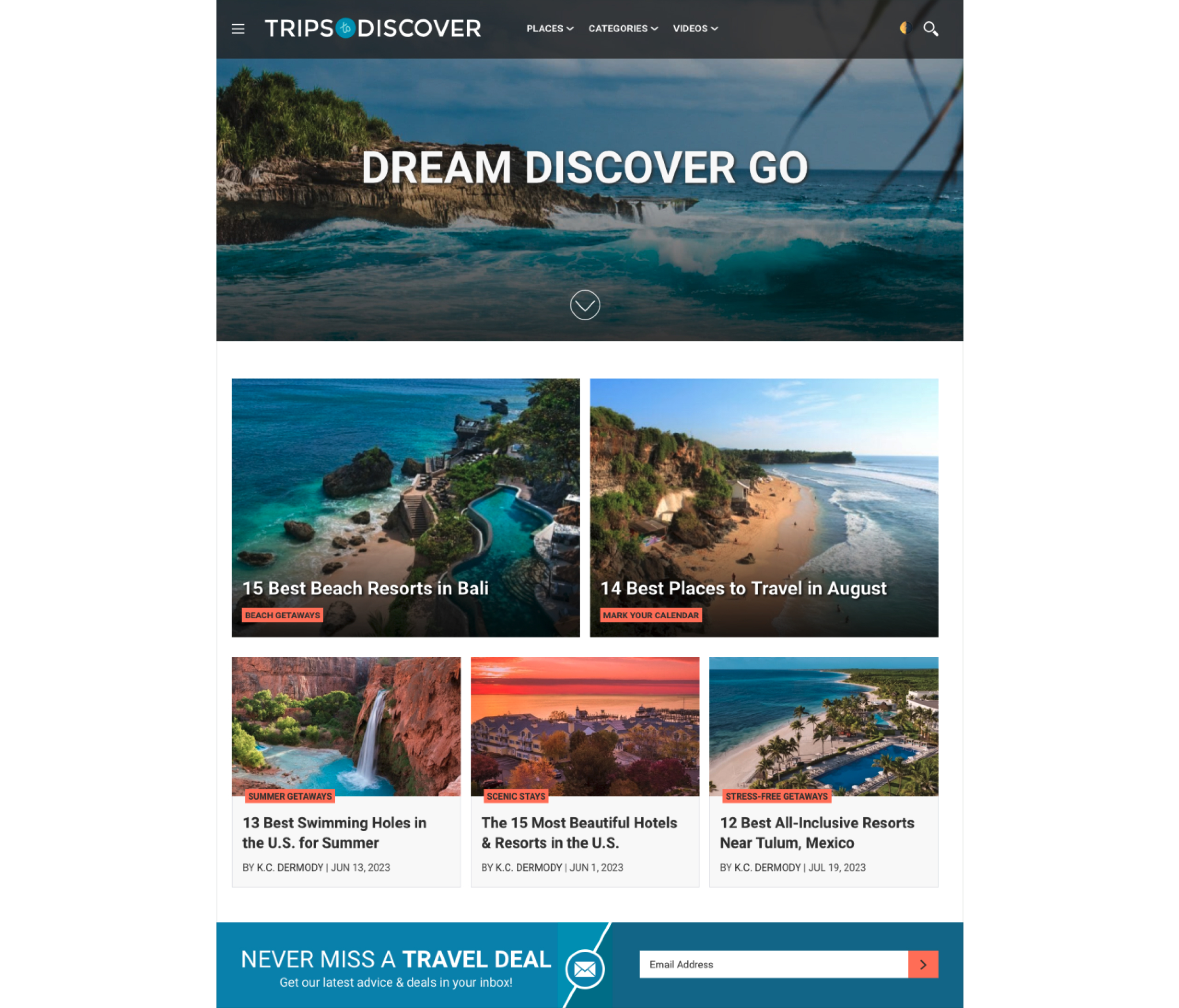
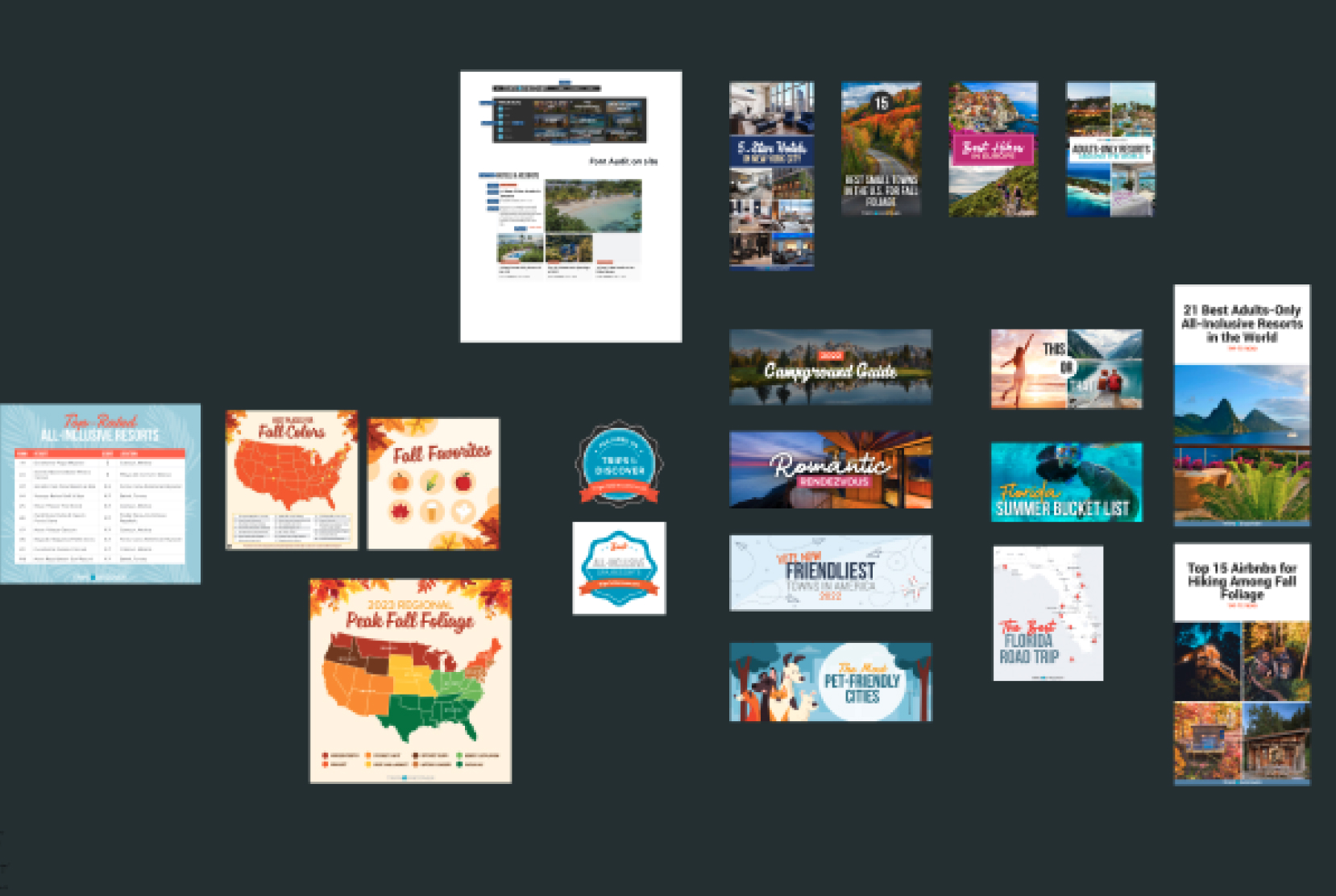
I began designing a set of Figma components of all the current elements within the system— menus, cards, lists, and some key page layouts.
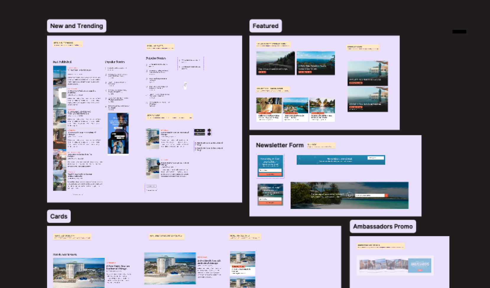
It became evident that, while a basic brand style guide existed, substantial work was required to define a clear brand essence and refine the brand elements comprehensively.
Following some conversations around typefaces and the brand, I began discussions with the CEO and marketing manager to explore new typefaces.
I had put forward the suggestion to choose new typeface families (1-2) that could consolidate the fonts in use, and to reflect the personality of the brand.
Following some discussion and workshops with the graphic designer, it was apparent that there was several more fonts in use.
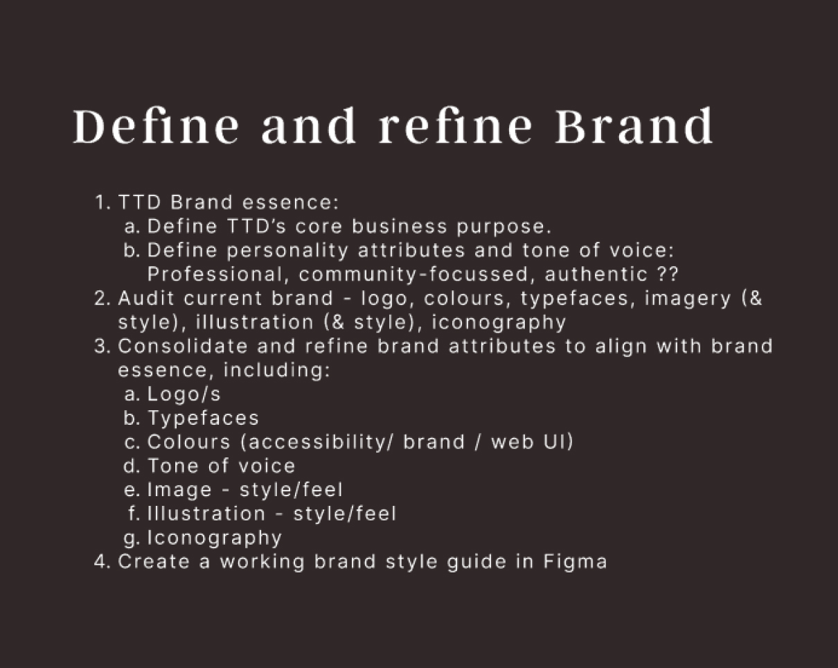
At this point, I realised that a larger discussion was needed to clarify the core brand values and better understand the platform's target audience.
This presented a significant challenge and a potential roadblock, as it affected the entire UI. Additionally, it would take time because the CEO and team was naturally emotionally invested in the existing brand, and the changes would have wide-ranging implications across all channels, including social media.
To provide some scaffolding to help our discussions and direct the way we went about making decisions, I put together a rough plan.
I aimed to shift the approach to design decisions— to be guided by core brand values and attributes, rather than by personal preference or layout.
While discussing with the CEO his vision to spotlight authors and their expertise on the platform, I took the opportunity to explore some new features and proposed typefaces in a new layout. I aimed to get the CEO and the team excited about the possibilities for a future version of the website, and help make a decision on the typefaces.
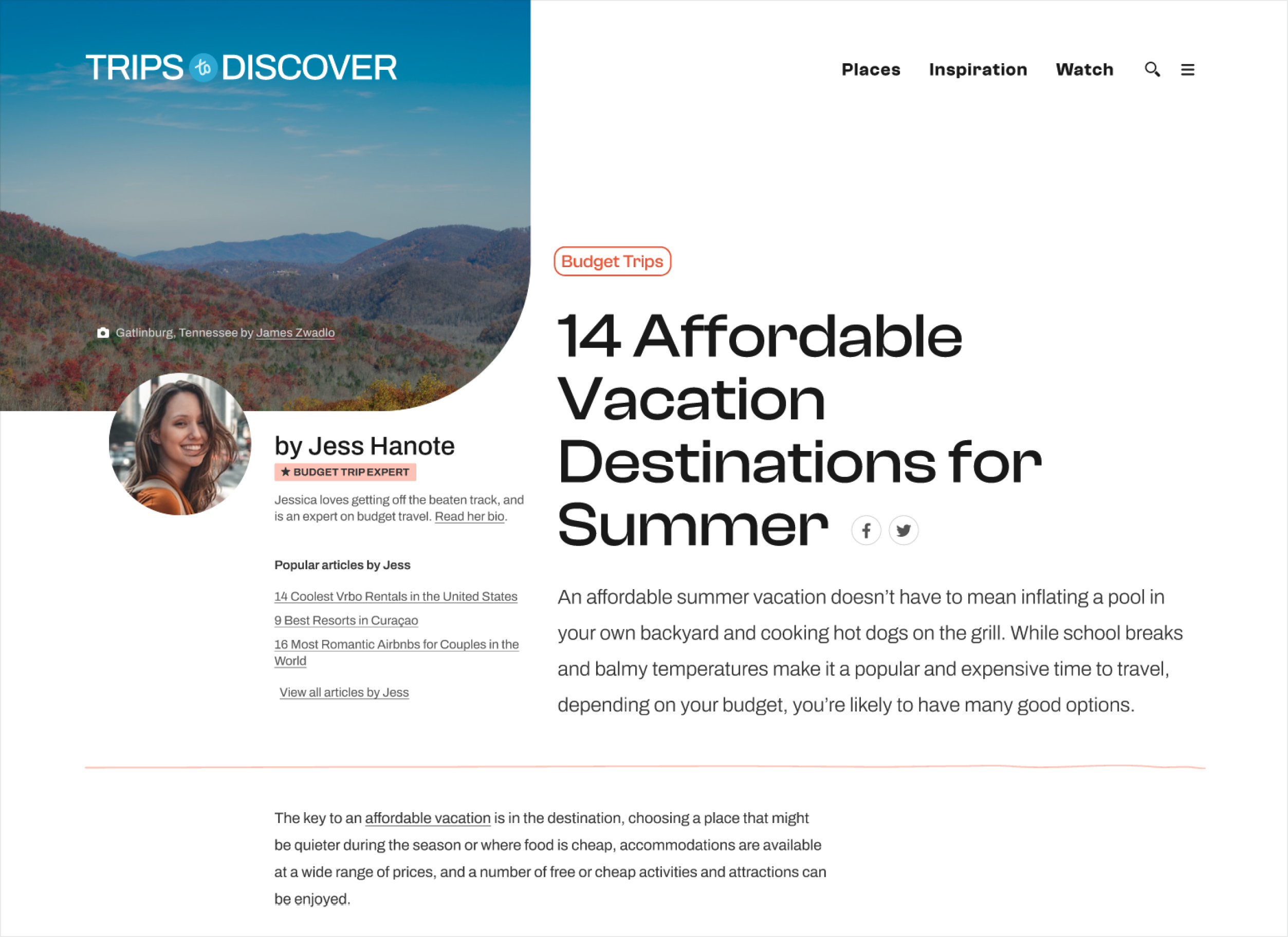
The CEO loved seeing the vision for a future iteration of the website, and wanted to incorporate some of the ideas into the website.
The process of defining and refining the brand made progress— a brand vision and values were defined, and this helped with making a decision on new typefaces.
Doing some target audience research would have helped with understanding their needs and what features should be built into the platform— but for now, the focus was on finishing and implementing a new layout.
Until now, the development team and I had been making incremental changes to the codebase. We reached a point where we needed to consolidate a v1 of the new designs and implement.
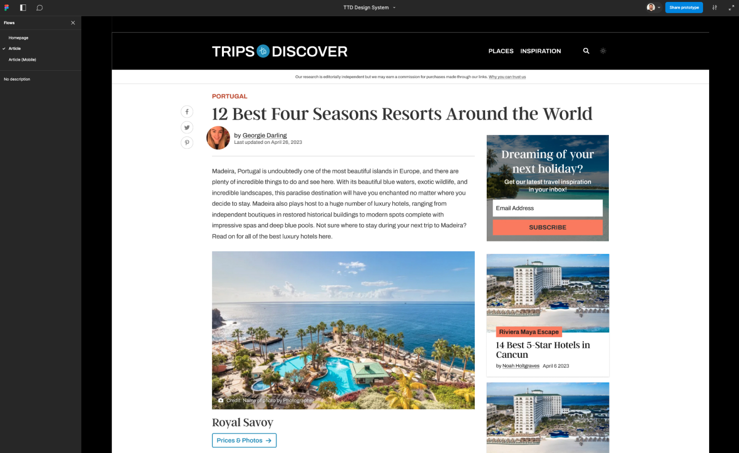
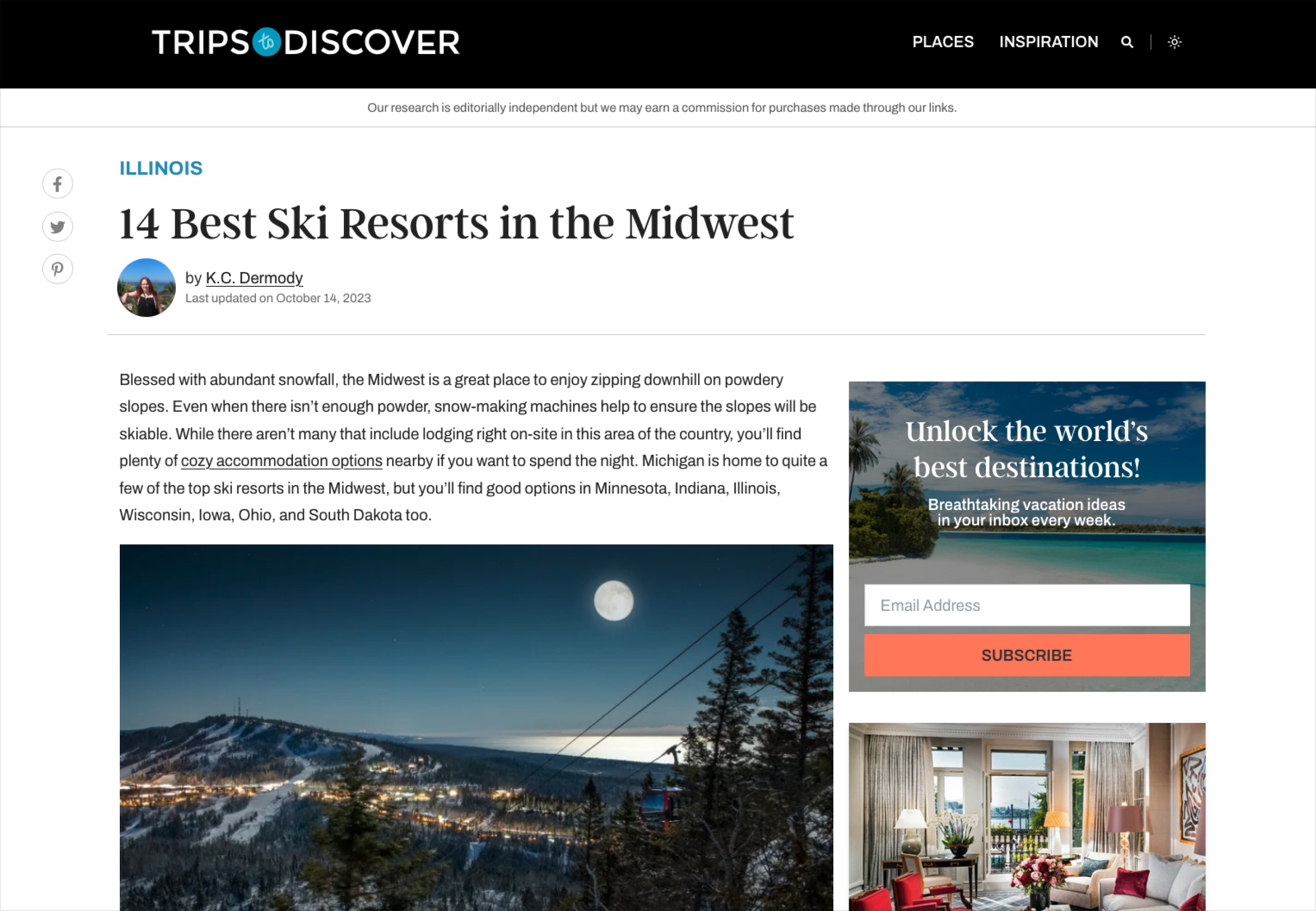
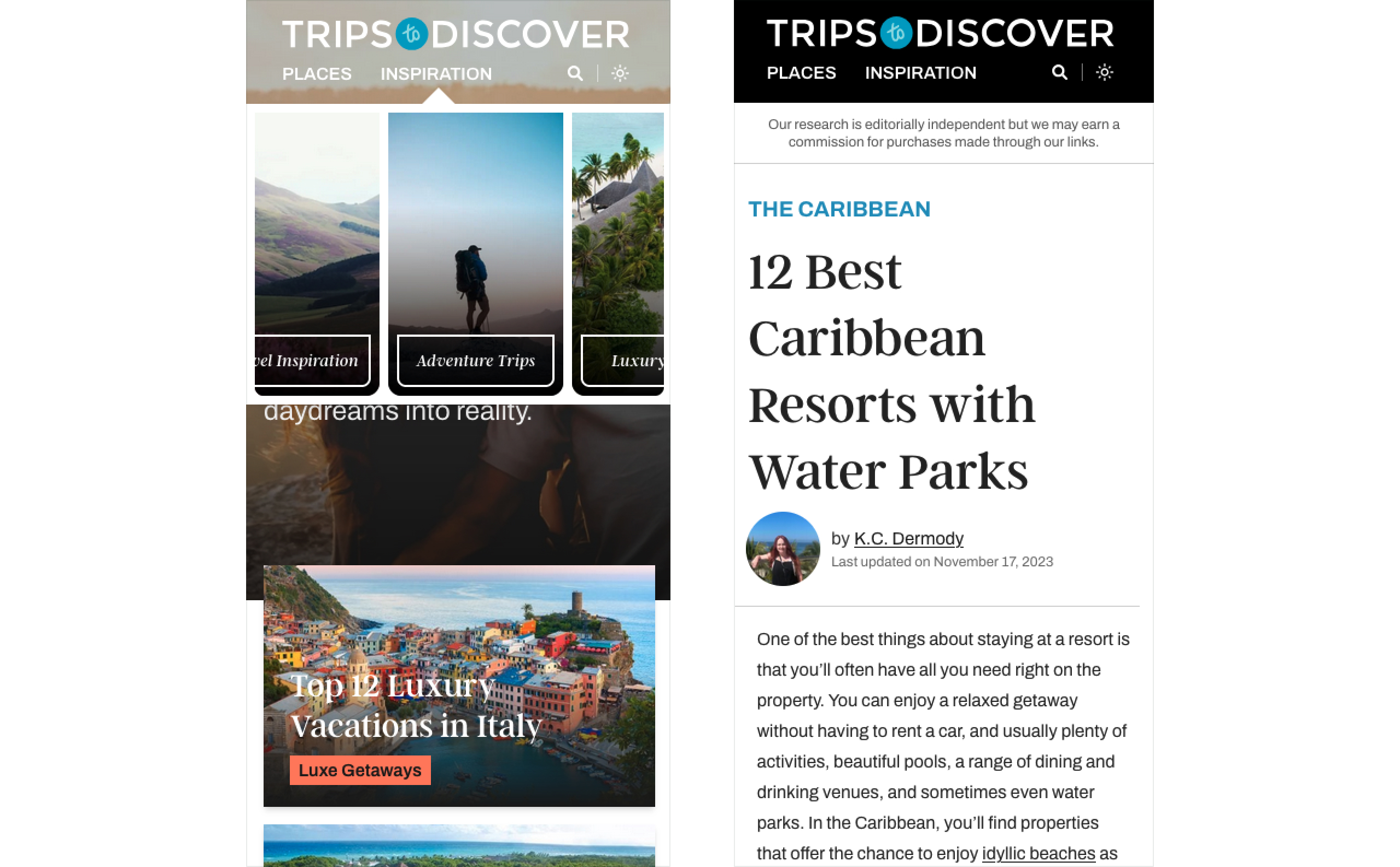
I finished off the design of all the Figma components and reviewed with the lead developer and built the layouts into a working prototype for review and sign-off. I also worked with the lead developer to setup a kan-ban of dev tasks and a new branch off the codebase to build the new version of the platform.
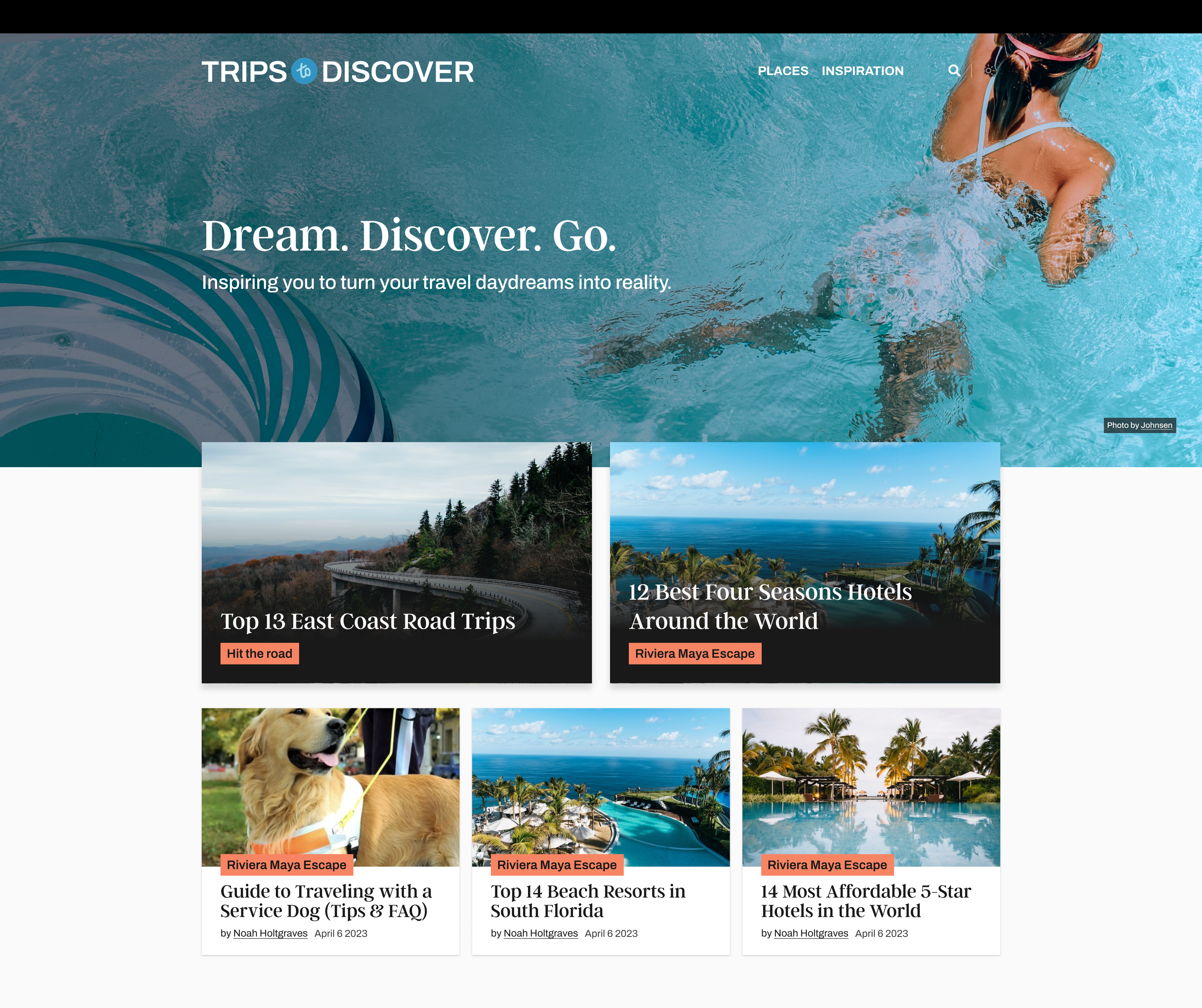
The CEO and team were thrilled with the updated design, which received positive feedback from customers. Buoyed by this success, we next focused on developing an enhanced hotel bookings project to extend the experience for users of the platform.